


Table of contents

No headings in the article.
As a young curious unemployed graduate, I had enough time to go through different things and asked myself several questions to which I still haven’t found answers yet. While on the verge of learning new things on the internet, the view of different websites amazes me. I mean, who won’t be amazed at how things collapse and widen on different screens? Then I got to know about Tech and the several niches in it. My enlightenment on Responsive Designs kicked off when I enrolled as a trainee in product design at Joseph Brendan Bootcamp earlier this month. As a product design trainee, I was taught that a responsive design gives room for a good user experience because it adapts, responds and overcomes all screen sizes which in turn let the contents flow well.
The Definition
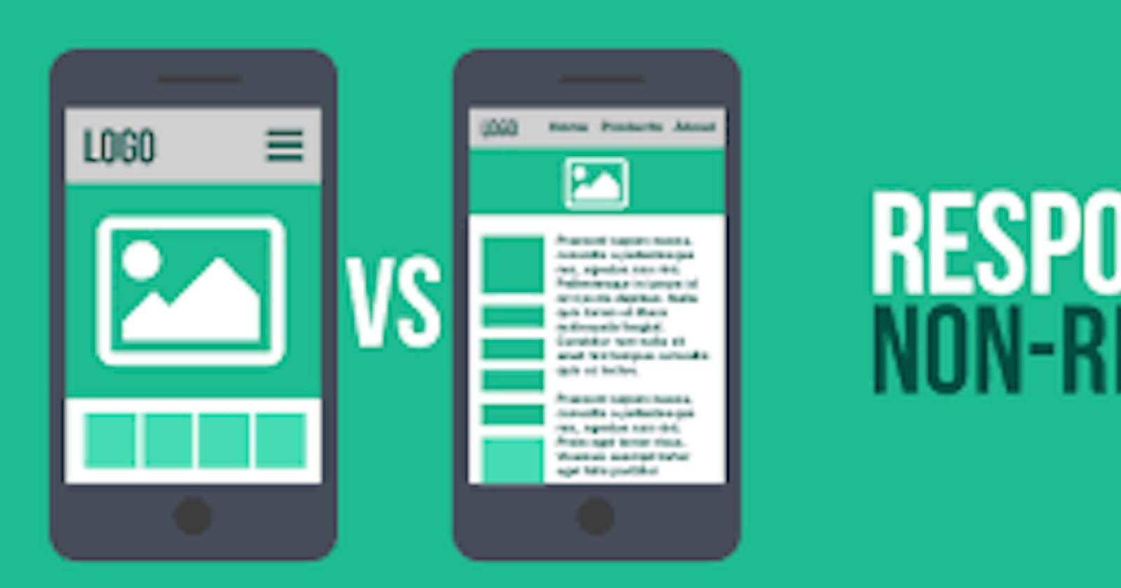
In layman’s words, a responsive design is a room that automatically adjusts to the flow and number of people in it. The idea of a responsive design is to have designs that respond and visualize well on different screens depending on the screen size and orientation of the device being used to view it. In the modern word that we are now, several people use the internet for different purposes. While trying to access the internet, people use different gadgets like television, desktops, Pc, tablets iPad, and cellphones. Designs built for desktop and pc alone will definitely not look good and flow well on other gadgets which will restrict the users of the design to be desktop owners alone.
The Concept
I learnt that the concept of responsive design is to focus on the contents. Content prioritization is a key aspect to focus on while designing. If users don’t instantly see what they want on a desktop monitor, they can easily glance around the page to discover it. On a smartphone, users may have to scroll endlessly to discover the content of interest. Smart content prioritization helps users find what they need more efficiently. Also, because elements need to be able to resize and shuffle, it is often easier to implement a responsive design on a site that is focused on content, rather than functionality. Complex data or interactions can be hard to fit into modular pieces that are easy to shuffle around several pages.
The Elements.
As I was getting exposed to responsive designs and itsconcept, I found out about the elements of a well-designed responsive website. Below is a list of the elements.
· Consistency
· Compatibility
· White space
· Intuitive navigation
· Optimized image
Oh, I won’t forget about the best practices to take into consideration before and while working on a responsive design. I learnt this from my tutor JOSEPH BRENDAN.
· Take the “mobile first” approach: Designing for the mobile view with a high scale which will let it fit comfortably into a bigger screen.
· Use only Scalable Vector Graphics
· Create fluid grids and image
· Include three or more breakpoints
· Prioritize and hide content to suit users’ contexts
· Aim for minimalism.
· Apply design patterns.
· Aim for accessibility with font sizes/styles.
Conclusion
What John Allops said about Responsive Design
“The control which designers know in the print medium, and often desire in the web medium, is simply a function of the limitation of the printed page. We should embrace the fact that the web doesn’t have the same constraints and design for this flexibility. But first, we must ‘accept the ebb and flow of things.’
In conclusion, Learning to design responsive content has done a lot of good for my journey as a trainee. I’ll say there are no aesthetically pleasing websites without a responsive design. No design will sit well if it doesn’t fit into the screen it’s meant to